Blog

7 Best Ads I’ve Collected this Week
I break down ads to ultimately learn and implement better copywriting & creative strategy principles in my day-to-day.
Here are the best ones I found this week as I review them in public for you.
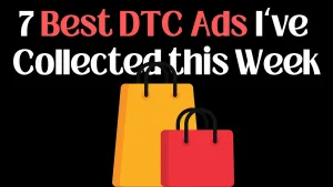
1. Huel
Huel’s ads are always noteworthy.
Here’s why this one is too!👇🏻
→ USP in headline
→ Minimal graphics
→ Pointing out features
→ Focus on per-unit price
Lesson: Do not overcomplicate what you have to say.
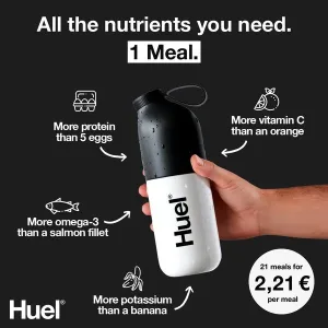
2.Spacegoods
Y
The best way to introduce a new flavor? Show it in action and recall the benefits.
This ad follows the classic reverse pick-up hook. Plus, it feels organic because the creator is simply making a drink while talking.
Lesson: Don’t sell. Say
3. MUD\WTR
The best part about this creative is the angle and positioning.
Here, MUD WTR is not a new drink in a budding category.
It’s a coffee alternative.
More relatable and enemy-focused.
Lesson: Find an enemy. Position against them.

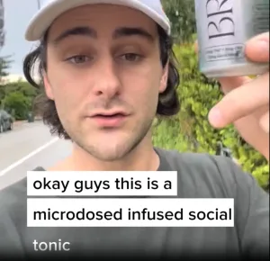
4. Brez
This ad falls perfectly into the not-like-an-ad category.
Creative is simple — talk to the camera with benefit-driven info.
Ad copy starts with contextual & detailed social proof + a quick what it is & how it helps you statement.
Lesson: Start with the strengths.
5. Harry’s
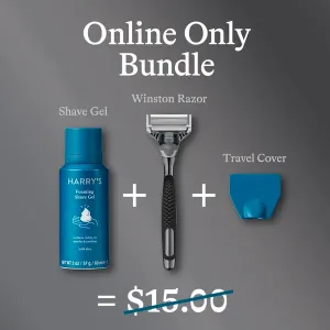
I like how Harry keeps it simple.
They literally use the creative and ad copy to describe the offer.
What you get inside + the price.
Perfect for activating new customers.
Lesson: Sometimes a good offer beats good copy.
6. Blissy
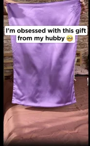
Blissy is a pillow brand with genius positioning.
They not only talk about better sleep but also better hair and skin.
Plus, this gifting angle works well for a quality-of-life product like this.
Lesson: Choose an angle based on positioning.
7. Long Wknd
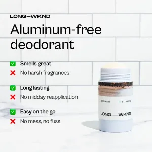
This creative from Long Wknd is quite good for 2 reasons.
1. It is simple and easy to consume.
2. It’s a two-way sword of listing a benefit while fighting an objection.
Lesson: Use benefits + objections together to create contrast.
What’s your favorite ad out of these?
Let me know in the comments!
Click here to get a FREE consultation from us.


